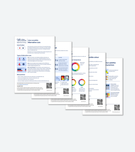
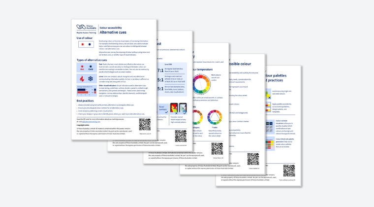
A complete collection of five A4 printable visual cheat sheets for mastering colour accessibility.
Quickly reference WCAG colour contrast requirements and accessibility best practices.
Create accessible colour palettes that work for all users, including people who are blind or have low vision and people with colour vision deficiency.
Why you need the Colour Accessibility Cheat Sheets
Colour choices can create significant barriers for people with disabilities, including people who are blind or have low vision, people with colour blindness, and people with cognitive and learning disabilities. Poor colour contrast and colour-only communication exclude millions of users from accessing your content effectively. To make accessible colour selection straightforward, we have developed this comprehensive bundle of five printable A4 visual cheat sheets covering everything you need to know about colour accessibility.
Everything you need to know about colour accessibility
What's included: Alternative Cues: Learn to communicate information without relying solely on colour Colour Contrast: Master WCAG contrast requirements for text and non-text elements Creating Accessible Colour Palettes: Follow our 7-step process for inclusive palette development Colour Theory: Understand colour relationships, schemes, and temperature for better accessibility Tools and Best Practices: Access essential resources and proven techniques for colour accessibility
Bridge the gap between design and accessibility
This complete collection is essential for graphic designers, UI/UX professionals, web developers, accessibility specialists, and anyone responsible for digital design decisions.
$14.99